A hill chart visually represents the progress of various tasks in a project .1 Imagine your project as a hill-shaped curve where each task is represented as a point, and its position on the hill reflects its current stage.
A hill chart’s core idea is that every task has two phases: an uphill phase and a downhill phase.
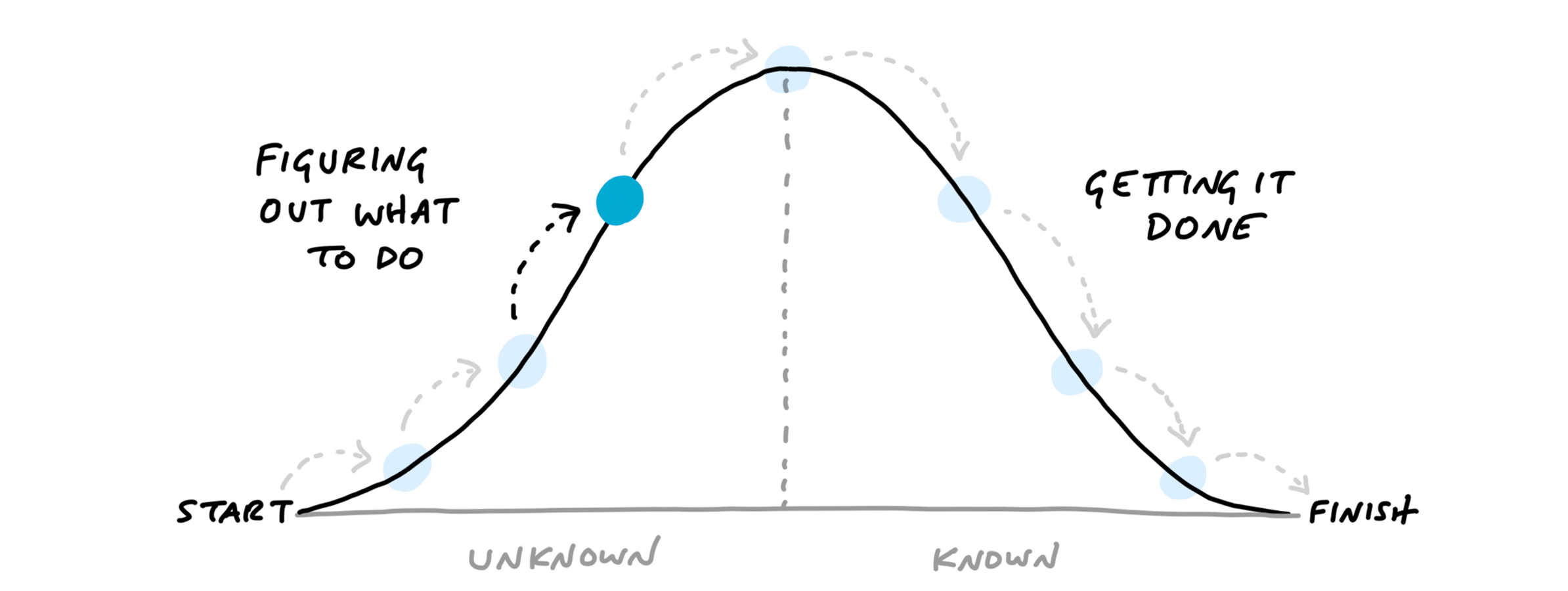
In the uphill phase, we focus on identifying possible approaches and potential hurdles. The downhill phase starts when we execute the chosen approach to complete the task.
To turn your to-do list into a hill chart, visualize each item as a point on the hill.2 When starting tasks, most of the tasks are clustered on the left at the bottom of the hill.
As you progress on each task, move the points accordingly:
- Points staying uphill: Tasks requiring further investigation, decision-making, or encountering unexpected challenges remain on the uphill side.
- Points moving downhill: Tasks with a clear path forward and active execution move steadily downhill, representing progress towards completion.
Focus on moving points over the hill to transition from planning to action.
Hill charts allows us to identify potential bottlenecks, track progress efficiently, and prioritize tasks effectively.
Footnotes
-
Ryan Singer developed this idea of hill charts at Basecamp. You can read more about hill charts in his book, Shape Up. Basecamp offers hill charts as part of their project management software. ↩
-
You can use Hillchart.co, a free tool to create your hill charts for your projects. ↩